“Every little detail of the design has a deeper meaning.”
BOTANISTRY is a passion project by co-founders Rashmini and Rukshan Mather, carefully conceptualised in every way, from the sourcing and formulation to the product development and testing. Wanting their level of care and kinship to be reflected in an inspired identity, the Mather cousins approached global agency Pearlfisher to collaborate from the start in a new brand partnership. This is a look behind the design story of BOTANISTRY.
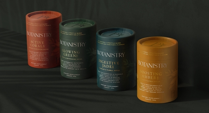
Based in Copenhagen, Louise Hvenegaard, Pearlfisher Design Director, talks about specifics on the branding and packaging design of BOTANISTRY. The wellness brand launched in May 2021 with four products to support health goals: ACTIVE CORALS for active health, GLOWING GREENS for healthy skin, DIGESTIVE JADES for better digestion and BOOSTING AMBERS for stronger immunity.

What was the design objective with BOTANISTRY?
Rooted in the Sri Lankan heritage of cousins and co-founders, Rashmini and Rukshan Mather, BOTANISTRY is a premium wellness brand that harmoniously balances function and flavour, body and mind, as part of an all-natural lifestyle. We wanted to break through the noise and clutter that is evident in the wellness category to create an authentic and premium brand that truly reflected the holistic purpose of these beautiful products suitable for every lifestyle. We saw the brand personality as empathetic and synergistic – listening, understanding and focusing on a path in life where true wellness comes from within. The creative approach draws on the central idea of a botanist’s notebook, intrinsic balance as well as a sense of duality – tradition and modernity, function and flavour, body and mind – expressed in a calming and modern design.

Tell us more about the brand logo?
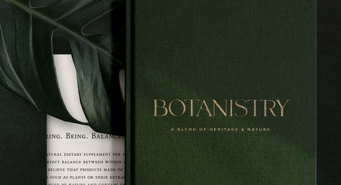
We liked the story of cousins and co-founders, Rashmini and Rukshan – their passion and their authenticity. The 100% natural dietary supplements they created are strongly rooted in nature, family and the ancient science of Ayurveda. This is elegantly captured in the brand name and tagline – BOTANISTRY, ‘a blend of heritage and nature’. When designing the brand logo, we made it stand distinctive and strong, yet subtle and sensitive. It has a bespoke feature flowing naturally through the letterforms, something a little unexpected as it would be in nature.

There seem to be nuances and subtleties the brand is trying to convey to the target consumer. How were you able to capture this?
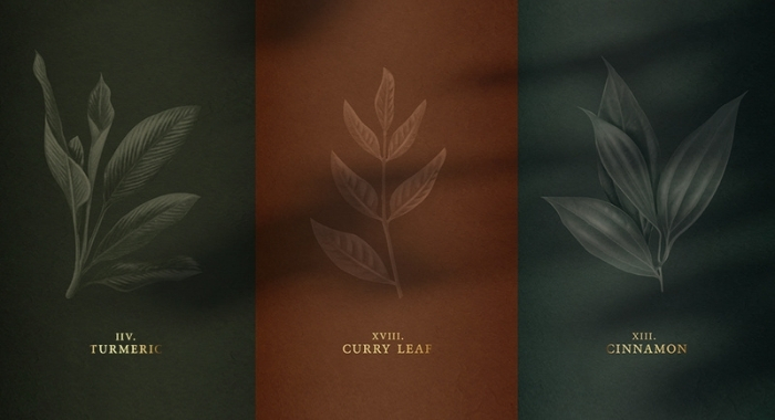
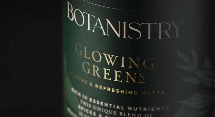
Every little detail of the identity and design has a deeper meaning and speaks to the duality at the heart of the brand. For the brand mark, the ‘B’ of BOTANISTRY becomes a stand-alone symbol of quality and integrity – promoting the values of ‘bearing’, ‘being’, ‘balance’. The five intertwining leaves represent the five plant ingredients found in each blend. Drawing from botanical sketches, the illustration is a composition of five humble ingredients, reiterating the significance of five elements to the brand. We crafted the font styles of Garamond BE and Gotham for the product descriptors to signify that the brand is both rooted in tradition and yet functional and modern.

How did colour play a role in the branding for BOTANISTRY?
The verdant green and warm tones for the brand are inspired by the plant ingredients themselves and the forests and community gardens they come from. It is a rich brand colour palette of olive green, spice red, dark yellow and deep blue. The canister colours and two-tone botanical illustrations create a beautifully sensorial effect in their depiction of the natural properties, flavour and experience of each blend. This is combined with the functional benefit to create the expressive and emotive product names – ‘Boosting Ambers’, ‘Glowing Greens’, ‘Active Corals’ and ‘Digestive Jades’. This approach allows for a unique naming structure that helps tell a richer, deeper story overall.
Read more about BOTANISTRY’s design journey with Pearlfisher here.
See the BOTANISTRY feature on The Dieline (the world’s most visited packaging design website) here.
The design and branding for BOTANISTRY was shortlisted at the prestigious Danish Creative Circle Awards 2021.
Post a Comment
You must be logged in to post a comment.


